The form builder in CourseSales.com distinguishes it from most student management systems. By being able to have different forms for different process paths and different process steps an organisation can gather the right information for specific occasions. This flexibility extends to the fields used to create the forms. These range from content, usually HTML messages that might vary by course, to uploading files to store with the registration and contact (if a document) or the status (if via a process step).
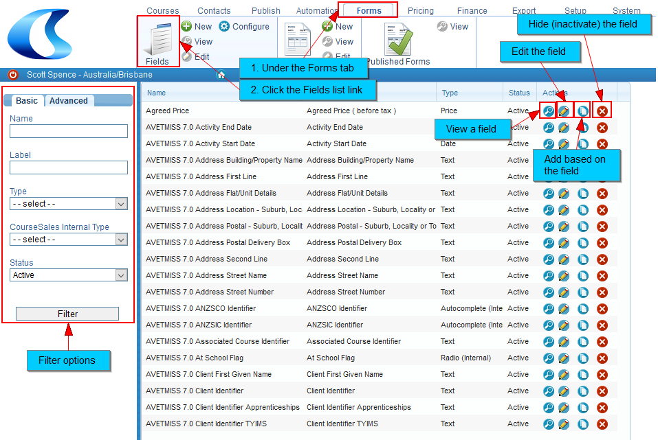
Fields can be found under the Forms tab in the ribbon. With the correct permissions users have the ability to add, view or edit fields. There is an additional ‘manage’ action which allows the creation of AVETMISS fields and/or forms and any other specialist activities related to fields.
Following the ‘Fields’ link will take you to the list of fields available for editing. The following explains the field list:
Following the pencil or ‘edit’ button will then allow you to make changes to your chosen field:
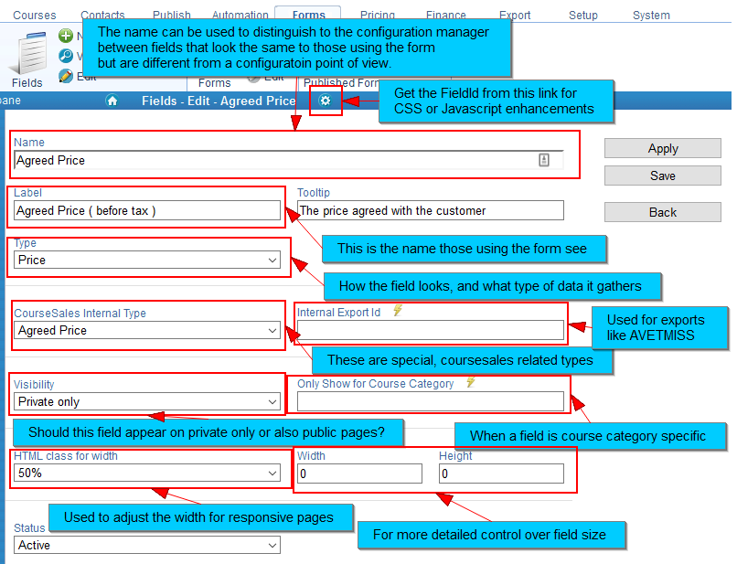
Which field options you choose, eg Type will reveal additional fields. The following is a list of the fields when you are adding or editing:
Name
A free text field, this name is used when configuring the forms and displaying in the field list. We recommend you consider a consistent naming structure to aid in management of your fields, ie you will notice that if you use AVETMISS fields all these fields begin with “AVETMISS 7.0”
Label
A free text field, this label is used when displaying to the person using the form, ie customers when a public or external form and administrators when a Process Step form. Different forms can have the same label.
Tooltip
This gives information to those using the form about what type of information should be entered or instructions.
Type
This is an internal list of all the types of field that CourseSales.com accepts. Selecting a different type will show or hide fields on the form, these are listed below.
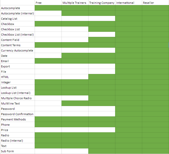
Not all field types are available in all licenses. See the following table to see what fields are available in which licenses.
-
Autocomplete
This uses a dynamic lookup in a pre-defined list, if the user types 3 or more characters then the lookup displays the top 10 options in a dropdown list. Upon selection there are additional fields shown: Types of Option and Default To (see below)
-
Autocomplete (internal)
Similar to Autocomplete, however upon selection there are additional fields shown: Internal Lists and Default To (see below)
-
Catalog List
This shows the list of catalog items, depending on the catalog group associated with the course master. When previewing a form with this field the words ‘This will show the list of catalog items for the course’ instead of an actual list of catalog items.
-
Checkbox
This is a checkbox to usually indicate an affirmative or negative choice eg: Invoice details are the same as above
-
Checkbox List
This is a list of items where multiple can be selected at once. Upon selection there is an additional field shown: Types of Option (see below)
-
Checkbox List (Internal)
Similar to above, however upon selection there ais an additional field shown: Internal Lists (see below)
-
Content Field
This is when content of the type ‘Field’ can be displayed on a form. Upon selection there is an additional field shown: Content (Field) (see below)
-
Content Terms
This field references where on the form to include the terms which are in turn specified on the course master. When using alternative Course Prices on the Course Master it could mean that a different terms apply for the same Course Master depending on if there is a content with type Terms that has that Price Type. When previewing a form with this field the words ‘This will show the Terms for the course’ instead of actual content.
-
Currency Autocomplete
This lists the currencies defined internally.
-
Date
Specifies a date field, where a calendar lookup appears to select a date, can be used with validation rules to ensure the correct dates are selected. The default date expected is in the format dd mmm yyyyy eg: 7 Mar 1973. On mobile devices this will indicate to the application to display a date selector. Upon selection there is an additional field shown: Validator (see below) Read more about dates here
-
Email
This uses HTML 5 basic email format validation, and will expect an email address in the format name@domain. Upon selection there is an additional field shown: Validator (see below)
-
Export
Sometimes the information we want to export comes from Options. It is not always appropriate to use the Option Name as the export value, so as an alternative the text in the Export Field can be used.
-
File
This allows you to upload a file with a form - the display of the file is on the same form. The file can’t be more than 2 Mb in size.
-
HTML
Used mostly for internal forms this enables the user to format text using HTML markup. Used for things like email signatures on the branch option form. Upon selection there are additional fields shown: Min Length, Max Length and Validator (see below)
-
Integer
A text field that only accepts numbers, on mobile devices a keyboard that only displays numbers should appear. Upon selection there is an additional field shown: Validator (see below)
-
Lookup List
Similar to Autocomplete, however has the list immediately as a drop-down, not suitable for long lists but suitable for those that the customer may not know what to look for, eg not for postcode/locality combinations but good for 6 possible reasons for attending training. Uses lists that you can create (or are already present) in Publish>Options. Upon selection there are additional fields shown: Types of Option and Default To (see below)
-
Lookup List (Internal)
Similar to Autocomplete, however has the list immediately as a drop-down, not suitable for long lists but suitable for those that the customer may not know what to look for, eg not for postcode/locality combinations but good for 6 possible reasons for attending training. Upon selection there are additional fields shown: Types of Option and Default To (see below)
-
Multiple Choice Radio
This is for the multichoice questions that could be used to deliver a quiz or test before or after a course. Examples include Language Literacy and Numeracy, CPR and First Aid quizzes. Upon selection there are additional fields shown: Question, Answer 1, 2, 3, 4, 5 & 6, Text to show if they select Answer 1, 2, 3, 4, 5 & 6, Which answer is correct?, How many points is this question worth?, and Message when the user gets the wrong answer (see below).
-
Multiline Text
Used mostly for internal forms this enables the user to submit multiple paragraphs of text. Used for things like email signatures on the branch option form. Upon selection there are additional fields shown: Min Length, Max Length and Validator (see below)
-
Password
Passwords are displayed usually as stars, not in plain sight. Upon selection there is an additional field shown: Validator (see below). The presence of the password field and a valid value in that field on a contact record permits a student to log into the student portal.
-
Password Confirmation
If this field is present then it is validated for a match to the password field. Upon selection the validation field is NOT shown, this is because this field should not be present on a form by itself, and it must be the same as the password field - which can have validation set.
-
Payment Methods
This shows the Payment Methods relevant to the payment group specified on the course master. When previewing a form with this field the words ‘This will show the list of payment methods for the course’ instead of an actual list of payment methods. Upon selection there is an additional field shown: Default To (see below).
-
Phone
This uses HTML 5 phone type, it does not do any validation but does ensure that the correct keyboard appears on mobile phones. Upon selection there is an additional field shown: Validator (see below)
-
Price
Allows the entry of a price amount, which should include numbers only. It let’s you have a field formatted as currency.
-
Radio
Radio is where of a list (in this case the options) only one can be selected. It is similar to Autocomplete and Lookup. Uses lists that you can create (or are already present) in Publish>Options. Upon selection there are additional fields shown: Types of Option and Default To (see below)
-
Radio (Internal)
Similar to Radio, however upon selection there are additional fields shown: Internal Lists and Default To (see below)
-
Text
This is a one-line free text field, the most common field when gathering information such as names, addresses etc. Upon selection there are additional fields shown: Min Length, Max Length and Validator (see below)
-
Sub Form
If you have a set of fields that you wish to duplicate across multiple forms then creating a field of a sub form will enable the subform to be included in other forms. Upon selection there is an additional field shown: Subform (see below)
CourseSales.com Internal Type
This is a list of internal field types which relate to special information namely:
-
Agreed Price - the price on the document to calculate the course price (excluding taxes, extras and surcharges)
-
Agreed Price Currency - the currency that the agreed price is if not the currency on the course master
-
Branch email - used when sending emails to the Branch in process rules
-
Content Terms Id - applying additional pricing and having associated terms means including this field on forms.
-
Customer Email - used when sending emails to the customer and perhaps also when matching contacts and/or defining unique Ids on contacts (therefore User Ids for Moodle & the student portal).
-
Customer Mobile - used when knowing which field to send SMS messages to.
-
Customer Name First - used when matching contacts and creating the registration list
-
Customer Name Surname - used when matching contacts and creating the registration list
-
Customer Invoice Contact Email - used when sending emails to the Customer Invoice Contact in process rules
-
HTTP Host - used when creating links where the domain varies depending on extranet links and other URLs send in emails. Can be used as a replaceable variable from the picker.
Internal Export Id
This is a list of values used to map fields for reporting purposes, eg: AVETMISS 7.0 Address First Line
Visibility
There are two options here: Private only and Public and private. This display the field as specified. Displaying Public means any form that is delivered via the trainer portal, student portal, as an extranet form or as a public form.
Only show for Course Category
If you only want to show a field for a particular course category, specify it here. On all forms where included the field will only appear for the specified course category.
HTML Class width
This is a range of widths from 10% to 100% in 5% increments. This enables the forms to be responsive to mobile and tablet devices with varying screen sizes.
Width
Should NOT be used; it is for backwards compatibility, prior to the width classes. If specified it would include a width in pixels on the field, which would break the responsiveness (ie ability to adjust based on the screen size).
Height
This is required for HTML and Multiline text fields. This is not required for content type fields, as the content will occupy the space it requires.
Status
Fields can be draft, active or inactive. If a field is inactive it will no longer display on forms when they are edited. If a field is inactive but still present in a published form the field will still be displayed, therefore after inactivating a field you will need to republish all forms to remove that field.
Additional fields
When a value is selected, eg Type, then additional options are displayed. For example:
Before ‘Autocomplete’ is select as an option
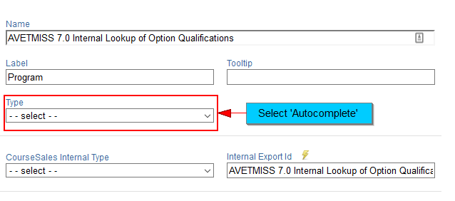
After ‘Autocomplete’ is selected:
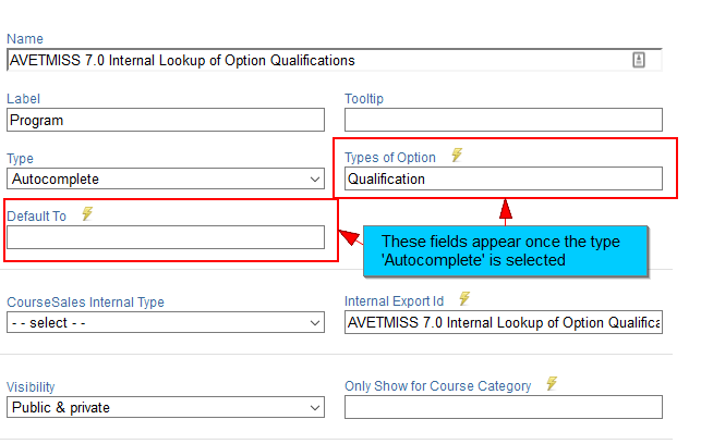
The following are the additional fields:
Types of Option
This is the list of all option lists (found under ‘Publish>Options’) ie: Course Categories, Branch, Contact Type etc.
Default To
This allows the selection of one of the ‘Types of Option’ to be selected as a default.
Internal List
This lists are for internal data, not available in options. These lists are maintained by CourseSales.com, ie: ISO3166-1 a2 Country List, AVETMISS 7.0 Study Reason etc.
Content (Field)
This is a list of all the content with the content type ‘Field’. Meaning that HTML content can be inserted as a field on a form. eg, you could list instructions depending on the course (as you could display the content dependent on the course category). For brief information to include on the form you may wish to use ‘Field text’ which can also accept HTML and Javascript.
Validator
This field includes pre-defined internal validation rules, beyond basic maximum and minimum which may be set for some field values. ie: AVETMISS 7.0 Date of Birth, eMail Address Validator
Min Length and Max Length
This is the minimum and maximum number of characters (letters, numbers and special characters) allowed, used with the mandatory values in the following ways: Scenario 1: mandatory and Min Length of 4 characters and Max Length of 6 characters; blank is not accepted, 5 characters is accepted. 7 characters is not accepted, Scenario 2: non-mandatory and Min Length of 4 characters, and Max Length of 6 characters; blank is accepted, 3 characters is not accepted, 6 characters is accepted.
Subform
This is a list of all the content with the forms of record type ‘Sub Form’. Meaning that the sub form can be inserted as a field on a form. eg, you could create one sub form that displayed the customer address, and this could be replicated on multiple forms.
Question
This is the question displayed to the student, which requires then a choice from the options that follow. We recommend you include a number on the questions - so that if a customer has a query about the question she is able to reference it and the configuration manager can identify that question quickly.
Answer 1, 2, 3, 4, 5 & 6
It is possible to have up to 6 options to select from. The answer number corresponds below to ‘Which answer is correct?’
Text to show if they select Answer 1, 2, 3, 4, 5 & 6
Each answer can have a response after submission. If the answer is chosen and the process path is configured to NOT have a fail step the display of the questions will then include a red line around those answers that were incorrect, and this text will display. It could for example, include advice about what to read to choose the correct answer.
Which answer is correct?
This is a drop down box of 6 options - each pertaining to the different answers.
How many points is this question worth?
Questions can have different point values, if a question has a value of 2 and is correctly select this will be used to calculate the total value to determine if the quiz has been passed. The points required to pass are defined on the form.
Message when the user gets the wrong answer
If the student gets the wrong answer a message can be displayed. This would mean that rather than giving answer specific advice a response to the question and be included, again if there is no ‘fail’ step included in the process path.